31.5.05

30.5.05

29.5.05
the media history project

“Promoting the study of media history from petroglyphs to pixels” – promettono e spiegano: “This site is hosted by the School of Journalism and Mass Communication, College of Liberal Arts, University of Minnesota, with additional support from the CLA Infotech Fees Committee”.
Ricca Timeline e link a non finire.
Non entusiasmante ma di qualche utilità.
28.5.05
pianeta tipografia

“Salve, siete alla scoperta della versione italiana di Planète typographie.
Le versioni francesi e inglesi del site propongono altrettante numerose informazini sulla tipografia”.
Traduzione in itagliano traballante ma meglio di nulla; assortimento di informazioni e risorce varie a proposita della tipografia:
Tipografia
arte tipografica, informazioni, risorce
Caratteri
fonderie, download
Storia della stampa
biografie, regioni, periodi storici
Istituzioni
organizzazioni, esposizioni e musei, biblioteche
Varie e eventuali
libri, a proposita della tipografia.
27.5.05
the advertising slogan generator
Per la (ormai) lunga serie generatori di testi vari, una pagina miscellanea di thesurrealist.co.uk (“All original content and concepts are from the gestalt brain of Kevan Davis and whoever he happened to be talking to at the time”) offre, tra altri, un impagabile The Advertising Slogan Generator per copywriters in crisi ideativa – testato, funzionante, esempio: “A Poisongalore Is Forever”. Sic.
26.5.05
intervista a lecaldano

Lucio D’Amelia intervista Alberto Lecaldano, progettista visuale e direttore di “Progetto Grafico”, la rivista promossa dall’Aiap, sul mestiere di grafico e i temi del Graphic Design, nelle pagine di MediaZone, magazine online di comunicazione e media, promosso dal dipartimento di sociologia e comunicazione della facoltà di scienze della comunicazione dell’università la Sapienza di Roma.
25.5.05
yale graphic design

Nel sito di Yale GDMFA, le tesi le trovate online, con archivio dal 2002 – ottima segnalazione di WB8in!

24.5.05
opentype specification
Nel sito Microsoft Corporation, tutto (o quasi) su OpenType: “The OpenType font format is an extension of the TrueType font format, adding support for PostScript font data. The OpenType font format was developed jointly by Microsoft and Adobe. OpenType fonts and the operating system services which support OpenType fonts provide users with a simple way to install and use fonts, whether the fonts contain TrueType outlines or CFF (PostScript) outlines”.
23.5.05
web e fonts: css2 specifications
Le specifiche dei font per CSS2—chi traffica con il web design, le conosce già: per gli altri, arduo ma interessante per conoscere i meccanismi interni.
“This specification defines Cascading Style Sheets, level 2 (CSS2). CSS2 is a style sheet language that allows authors and users to attach style (e.g., fonts, spacing, and aural cues) to structured documents (e.g., HTML documents and XML applications). By separating the presentation style of documents from the content of documents, CSS2 simplifies Web authoring and site maintenance”.
W3C Recommendation 12-May-1998.
“The World Wide Web Consortium (W3C) develops interoperable technologies (specifications, guidelines, software, and tools) to lead the Web to its full potential. W3C is a forum for information, commerce, communication, and collective understanding”.
22.5.05
standard: tipi e carte
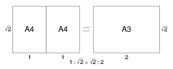
Da consultare (e ricchi di ulteriori rimandi) i repertori di standard procuratici ancora da GT:
“Il baldo Markus Günther Kuhn, testé lecturer in quel di Cambridge, offreci queste utili rassegne:
1 . metric typographic units
2 . international standard paper sizes”
21.5.05
materiali didattici
Alessandro Segalini suggerisce: “un altro link bello pulito : [TypEdu] Reading matter”—ottima selezione per la didattica—“TypEdu is dedicated to the type design students of Hannes Famira”.

20.5.05
dizionario tipografico
“Piccolo, coinciso, sovente sbavato ed incompleto dizionario tipografico anglo-franco-tedesco-italo-ispanico, comunque utile raffronto” — segnala GT.
Concordo: “vocabulary–lexique,glossaire-Wortschatz-vocabulario[sic]-vocabulario”.
Nei dintorni:
Concordo: “vocabulary–lexique,glossaire-Wortschatz-vocabulario[sic]-vocabulario”.
Nei dintorni:
Questions de typographie
Cette page, composée par Jacques André, contient diverses informations sur la typographie. Nombre d’entre elles sont encore incomplètes.
Par ailleurs cette page risque de disparaitre dès qu’elle sera redondante avec la FAQ typographie en cours de (lente) gestation dans le cadre de la liste typographie.19.5.05
public lettering: signage studies
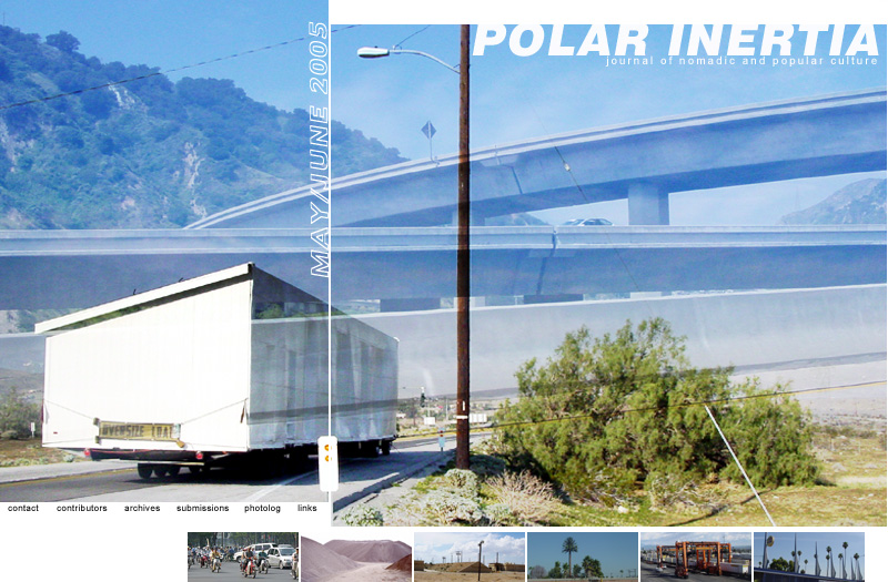
Nel sito di “polar inertia journal of nomadic and popular culture”, alcune serie di immagini sulla grafica ambientale e urbana in luoghi diversi del mondo:
urban supergraphics (15)
mexicali (18)
kuala lumpur (15)
los angeles (15).
Gallerie archigrafiche analoghe, già segnalate: bombay, montreal, chicago, londra e praga.
18.5.05
traffic signs

Bartolomeo Mecánico spiega: “Traffic signs are, besides the litter, among the more common objects along the road side. We see them, yet don’t look at them. Shame, because many signs are worth a closer look”.
Segnaletiche già segnalate qui: strassen ch, highway markers, tipografia (auto)stradale – tanto per gradire.
17.5.05
APHont

“APHont(tm) (pronounced Ay’-font), was developed by APH specifically for low vision readers. APHont embodies characteristics that have been shown to enhance reading speed, comprehension, and comfort for large print users. […] the entire APHont Suite is now available free of charge on the APH web site. The APHont Suite consists of Regular, Bold, Italic, and Italic Bold. One must certify use for or by a person with a visual impairment before downloading”.
16.5.05
museo de la comunicación

Interessante sito tipo-grafico di infoamerica.org su La imprenta y la tipografía: storia, tecnica, personaggi e gallerie varie – segnalato da FB, gracias!
15.5.05
logos 4: logotypes.ru
È ricomparso, il sito russo dei logotipi (scaricabili): ne trovate più o meno 5mila – bastano?
Eccone le FAQ
“Q: Are your logos self-made or developed by respective companies?
A: More than 80% of logos are taken from the respective trademark owners, publishing houses or creative bureaus, who promotes the brand. The rest are copied with maximum precision and quality.
Q: How could I download the whole collection by FTP?
A: There's no way. It's available on-line and never will be moved to another place.
Q: May I make your collection available on my own site?
A: No way. Mirroring is not permitted. Nevertheless you may feel free to put a link to my site.
Q: You probably earned much on this?
A: Not a dime, just expenses.
Q: I've got some logos you don't have. Can we make a trade?
A: Trade is possible when there's something to trade. I don't have one. I just give away everything. You may cooperate sending your logos to me.
Q: Ahaaa... I found a buggy logo!
A: Good boy! I must have missed it. Say where's this logo and what is the bug. Thanks for cooperation!
Q: How does the search system work?
A: The search system looks for your inquiry in the names of logos and their commentaries, which are both in Russian and English. E.g. for 'audi' inquiry the search system will find not only the logo of AUDI automobile company, but also the producers of audio-video items. This is why, you don't have to waste your time writing full description of the inquiry, just use part of the word and you'll widen the search by that.
Q: Why Adobe Illustrator used as a standard? There also CorelDRAW and FreeHand?..
A: CorelDRAW - it's a long and dull story, which'll take about 5 years of my life… You won't be able to use CorelDRAW format when working, say, with QuarkXPress, PageMaker and other DTP programs. You'll have to convert your original file into PostScript, for example. FreeHand, for instance, is a good program, but it is less known here, than, Adobe Illustrator. And why should we suffer, if Al is the most widely-spread format? I would appreciate if you could send me the program, which is not familiar with Al… Don't suggest NotePad or Simple Text. :-)”.
Già segnalati, se interessa: logos 1, logos 2 birra!, logos 3 airlines.
14.5.05
world paper money

Raccolta di oltre 4mila immagini di cartamoneta di tutto il mondo, in un sito commerciale di collezionismo (ve le potete comprare) – ma anche monete metalliche e altro – sito suggerito da FB, danke!
Per grafici consapevoli.

13.5.05
complaint-letter generator

Ancora un generatore di testi (vedi precedenti); nella fattispecie, lo Scott Pakin’s automatic complaint-letter generator. Se non sbaglio, devo la segnalazione a WB8 – merci bien!
Qui sotto un risultato che mi riguarda (ma ci si può lamentare anche di una company/organization).
A dire il vero, ne ho scoperti un bel po’ d’altri, più o meno divertenti — provate, ad esempio, i text generators elencati da Communications From Elsewhere.
“I've been hesitating to write this letter, because I've been afraid that, if I did, Prof. Sergio G. Polano would do everything in his power to make me sink into a miasma of doubt and alienation. But after reading about Prof. Polano's pudibund tirades, I could hesitate no longer. You see, I undeniably believe that people who agree with Prof. Polano's perversions are either stupid, drunk, on drugs, paid off by Prof. Polano, or are delirious porn stars. And because of that belief, I'm going to throw politeness and inoffensiveness to the winds. In this letter, I'm going to be as rude and crude as I know how, to reinforce the point that I once had a nightmare in which Prof. Polano was free to rewrite history to reflect or magnify an imaginary "victimhood". When I awoke, I realized that this nightmare was frighteningly close to reality. For instance, to Prof. Polano's mind, a totalitarian dictatorship is the best form of government we could possibly have. So that means that going through the motions of working is the same as working, right? No, not right. The truth is that Prof. Polano likes thinking thoughts that aren't burdensome and that feel good. That's why he is missing not only the point, but also the whole paradigm shift and huge sociological implications. Excuse me; that's not entirely correct. What I meant to say is that the point at which you discover that I, hardheaded cynic that I am, am appalled by the vast generalizations in Prof. Polano's claim that his witticisms are all sweetness and light is not only a moment of disenchantment. It is a moment of resolve, a determination that I want to make this clear, so that those who do not understand deeper messages embedded within sarcastic irony -- and you know who I'm referring to -- can process my point. Here's the heart of the matter: If you can make any sense out Prof. Polano's silly, vengeful litanies, then you must have gotten higher marks in school than I did. Prof. Polano is completely irritating. We all are, to some extent, but he sets the curve. So you see, I believe that it needs to be taken into account that corruption, lying, and hypocrisy are the fundaments of Prof. Sergio G. Polano's principles”.
12.5.05
typolis
Un sito ricco di contenuti, grafici e tipografici, da esplorare con attenzione (cliccare sul logo sopra) – grazie alla segnalazione di Fiorella Bulegato; in particolare, nella sezione shaping and design:
step by step a course leading from the idea to the finished printed work
crash course important typographic rules in increased speed.
11.5.05
a better dummy text generator

Alessandro Segalini gentilmente suggerisce il generatore di testo di adhesiontext®: “How does adhesiontext® work? A function collects all the words from the database that match the character set, and groups them according to its length. Then it builds the text block by copying random elements from these groups. Optionally, basic punctuation can be added and the first word of each sentence can be capitalised”.
Non immediato d’uso ma certo molto più flessibile dei vari Lorem Ipsum e antagonisti già segnalati.
10.5.05
9.5.05
avant-garde czech book design

La collezione del Cooper-Hewitt National Design Museum Library di libri progettati dai maggiori esponenti delle ‘“avanguardie artistiche” ceche degli anni venti-trenta: da Karel Bedrna a August Tschinkel, inclusi grandi protagonisti quali Ladislav Sutnar e Karel Teige; inoltre, biografie scelte e bibliografia (su gentile segnalazione di GT).

8.5.05
trabajando con tipos

Nel sito iberico Unos Tipos Duros teoria y practica de la tipografia, da esplorare con attenzione (ad esempio, ci trovate un compendioso tratado general de tipografia 1959), una bella sezione illustrata sui fondamenti di tipografia.

7.5.05
linea grafica

Come si legge nella pagina d’ingresso, “Linea grafica è la testata storica della grafica in Italia” - con archivio online dal numero 317, settembre-ottobre 1998.
5.5.05
travel ephemera
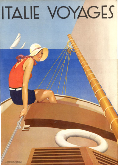
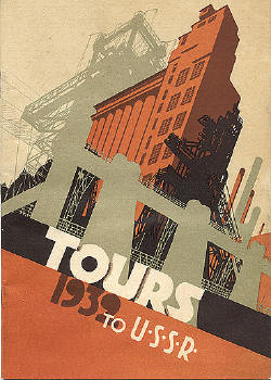
Come ben riassume GT: “Suggestioni e viaggi tipo-grafici” anni venti-trenta, nel ricco sito di grafica prevalentemente turistica curato da David Levine.
4.5.05
basta lorem ipsum

“Tired of using Lorem Ipsum for dummy text in your latest masterpiece? This text generator has been developed based on years of careful research and is guaranteed to improve even the most lacklustre of designs”.
Ma c’è anche la Greeking Machine di Duck Island e pure…

[Del lorem ipsum vero e proprio mi sono già occupato qualche tempo fa, pardon].
Se poi vi interessassero dei generatori di testi vari, provate
DadaDodo
Poetry Corner
The Band Name Generator
The Postmodernism Generator
The Brag Generator
Time Cube
The Dada Engine.
3.5.05
infografica
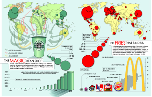
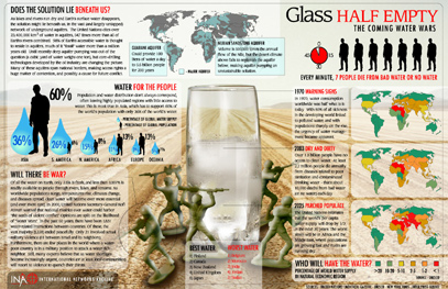
Dalla sezione Information Design and Data Visualization di masternewmedia.org di Robin Good: “If you are interested in data visualization for the scope of providing valuable and entertaining information to a wide and popular audience, this mini-manifesto from Princeton University Information Networks Archive (INA), may give you some good inspiration. Prepared by Jonathan Harris of Flaming Toast Productions (now Number27), this large and highly visual information displays mini-gallery make it easy to learn and explore large amounts of data while getting the whole”.
2.5.05
self publishing
L’infaticabile Gabriele segnala
Lulu.com
book*shop
cafepress
iUniverse
“Eppoi, chi + ne ha, ne metta: provar per credere, ovviamente per quei ch’l volessero toglierselo, lo sfizio; è possibile decidere, fra l’altro, anche ’l tipo di binding...”


Di mio, aggiungo (ma si tratta di self printing – basta cercare, per trovarne a bizzeffe) l’italica, anzi mestrina
pixART (con tanto di preventivo online) e un testo sul pod (print-on-demand ma anche publishing-on-demand) nella sezione/versione italiana del sito masternewmedia.org di Robin Good.
Lulu.com
book*shop
cafepress
iUniverse
“Eppoi, chi + ne ha, ne metta: provar per credere, ovviamente per quei ch’l volessero toglierselo, lo sfizio; è possibile decidere, fra l’altro, anche ’l tipo di binding...”
Di mio, aggiungo (ma si tratta di self printing – basta cercare, per trovarne a bizzeffe) l’italica, anzi mestrina
pixART (con tanto di preventivo online) e un testo sul pod (print-on-demand ma anche publishing-on-demand) nella sezione/versione italiana del sito masternewmedia.org di Robin Good.
1.5.05


in questa pagina
-
typotips
yo-yoll.net
the media history project
pianeta tipografia
the advertising slogan generator
intervista a lecaldano
yale graphic design
opentype specification
web e fonts: css2 specifications
standard: tipi e carte
materiali didattici
dizionario tipografico
public lettering: signage studies
traffic signs
APHont
museo de la comunicación
logos 4: logotypes.ru
world paper money
complaint-letter generator
typolis
a better dummy text generator
libri futuristi
avant-garde czech book design
trabajando con tipos
linea grafica
travel ephemera
basta lorem ipsum
infografica
self publishing
maggio
