Alfabeti e lingue del mondo nel sito ispanico Proel.
Omniglot: una guida ai sistemi di scrittura, passati e presenti, a cura di Simon Ager, con links utili.
Un vero atlante storico delle gui, le interfacce grafiche utente: the “guidebook, a website dedicated to preserving and showcasing Graphical User Interfaces”.
This collection of airline logos is one example of the interesting array of materials the Museum of Flight, Seattle, houses. This collection was donated to the Museum and it dates back to around the early 1980s. It represents a snapshot of the many interesting logos used by air carriers at that date. As a historical collection, it is missing many of today's top carriers.
Il carattere più famoso di Arthur Eric Rowton Gill, illustrato nella Wikipedia, the Free Encyclopedia: inter alia, si segnalano le voci Typeface e Typography.
La vera storia di un tipo ubiquo: “Helvetica? — si chiede qualcuno — That’s that font that looks kinda like Arial, right?”
In omaggio, il tipo-quiz: Arial o Helvetica?
Negli archivi multiformat online della Library of Congress:
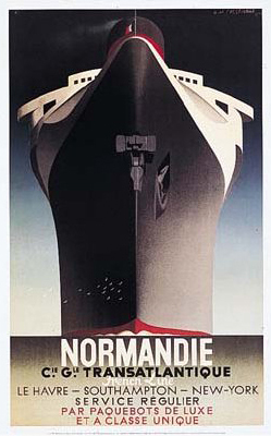
1 . The Emergence of Advertising in America: 1850-1920
2 . Broadsides and Printed Ephemera ca. 1600-2000
3 . Coca-Cola Advertising Films 1951-1999
4 . The Coolidge Era and the Consumer Economy, 1921-1929
5 . The Early Motion Pictures and Sound Recordings of the Edison Companies
6 . By the People, For the People: Posters from the WPA, 1936-1943
Fabio Fregonese segnala “un interessante sito, soprattutto per quanto riguarda la parte Handwriting, che presenta sia esempi che metodi per analizzare e migliorare la propria scrittura”: le pagine dell’islandese Gunnlaugur SE Briem, protagonista di una spiacevole vicenda col Times[*] di Londra, sono una sintetica quanto efficace introduzione al campo del disegno delle lettere e dei caratteri da stampa, così come alla pratica della chirografia e cioè la grafia manuale. [*Racconta Briem: “In 1990, I was asked to design a new typeface family for the London Times to replace Times Roman. The work took the better part of two years. When the paper introduced the design, it was credited to somebody else”; maggiori particolari nel sito.]
Già che ci siamo, qualche altro riferimento, più o meno sparso:
12 Rules for Good Cursive Handwriting sono spiegate da Christopher Jarman (“ex-Royal Navy and a retired teacher”), che mostra anche alcune pagine del suo libretto The Parents’ Guide to Handwriting; è possibile scaricare alcuni suoi font chirografici.
Spostandoci dall’Uk negli Usa, ove la questione della scrittura scolastica elementare è particolarmente viva e vivace (non senza riflessi economici), degno di nota un metodo recente (tra molti altri, a dire il vero) di gran successo e diffusione, quale il D’Nealian®, elaborato da


 Nicholas Fabian:


 questo si
 questo pure
 questo invece no


